
Supermemory

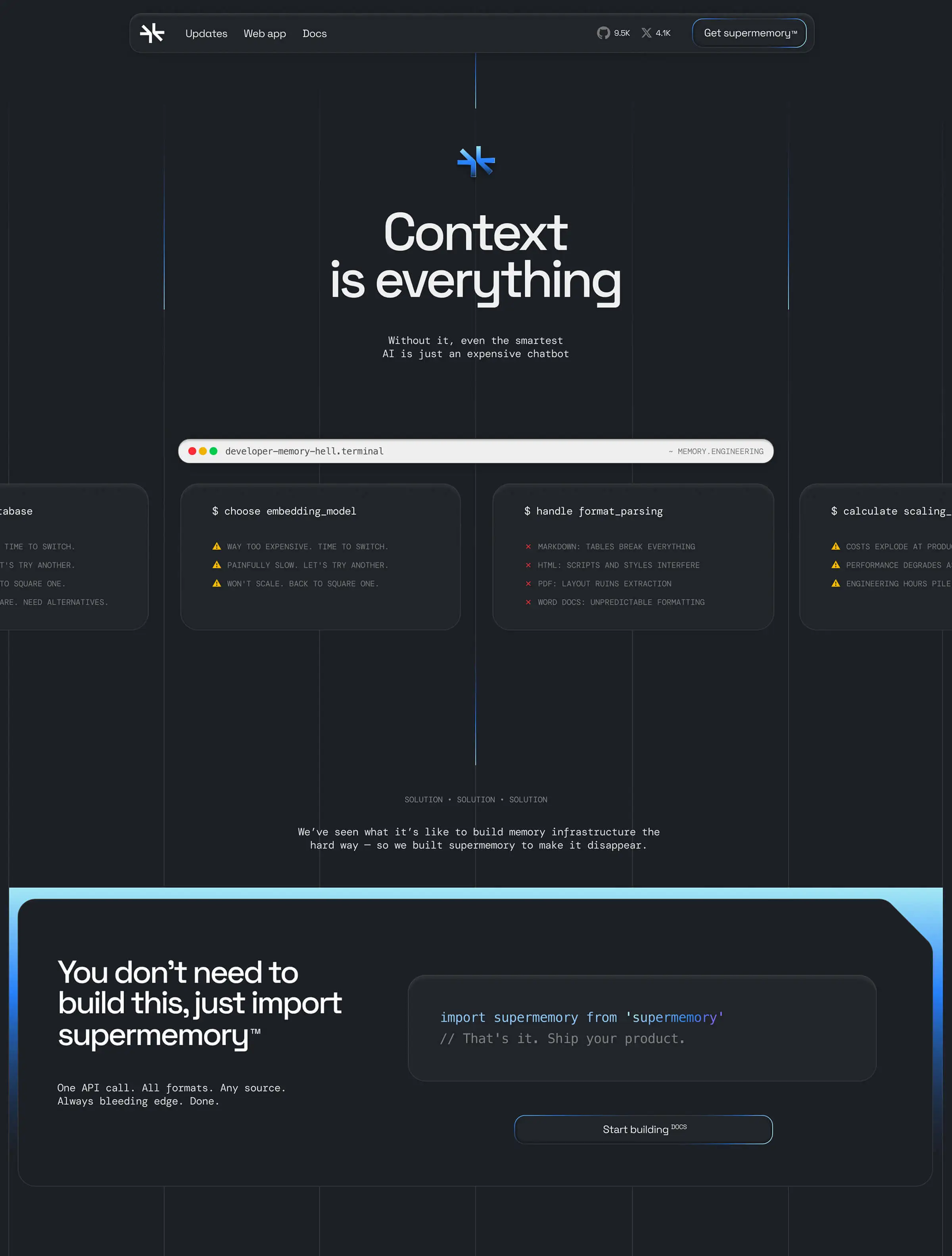
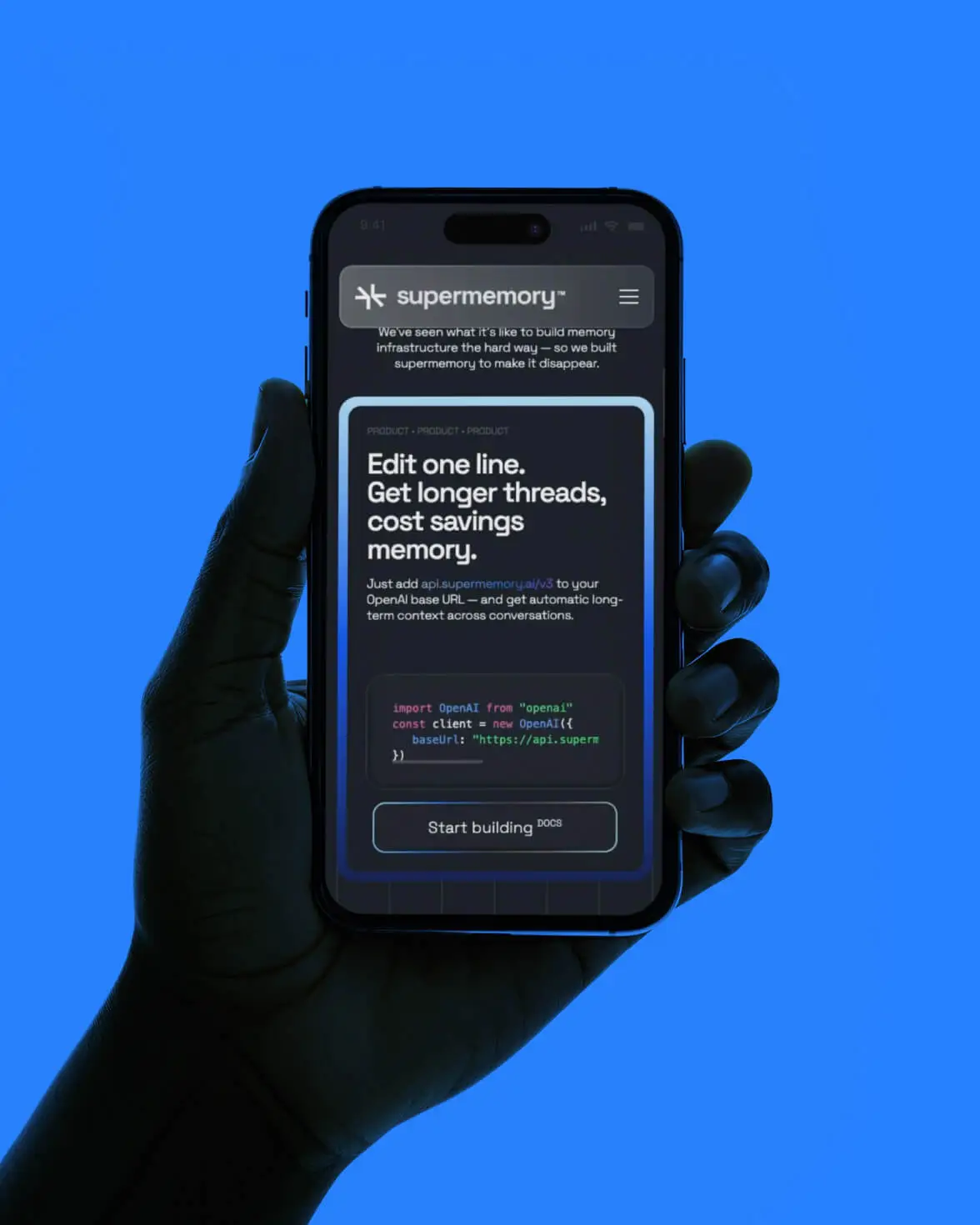
Supermemory does something wonderfully simple: it remembers what AI forgets. It keeps track of every detail, bringing structure, personalization, and retrieval at scale.
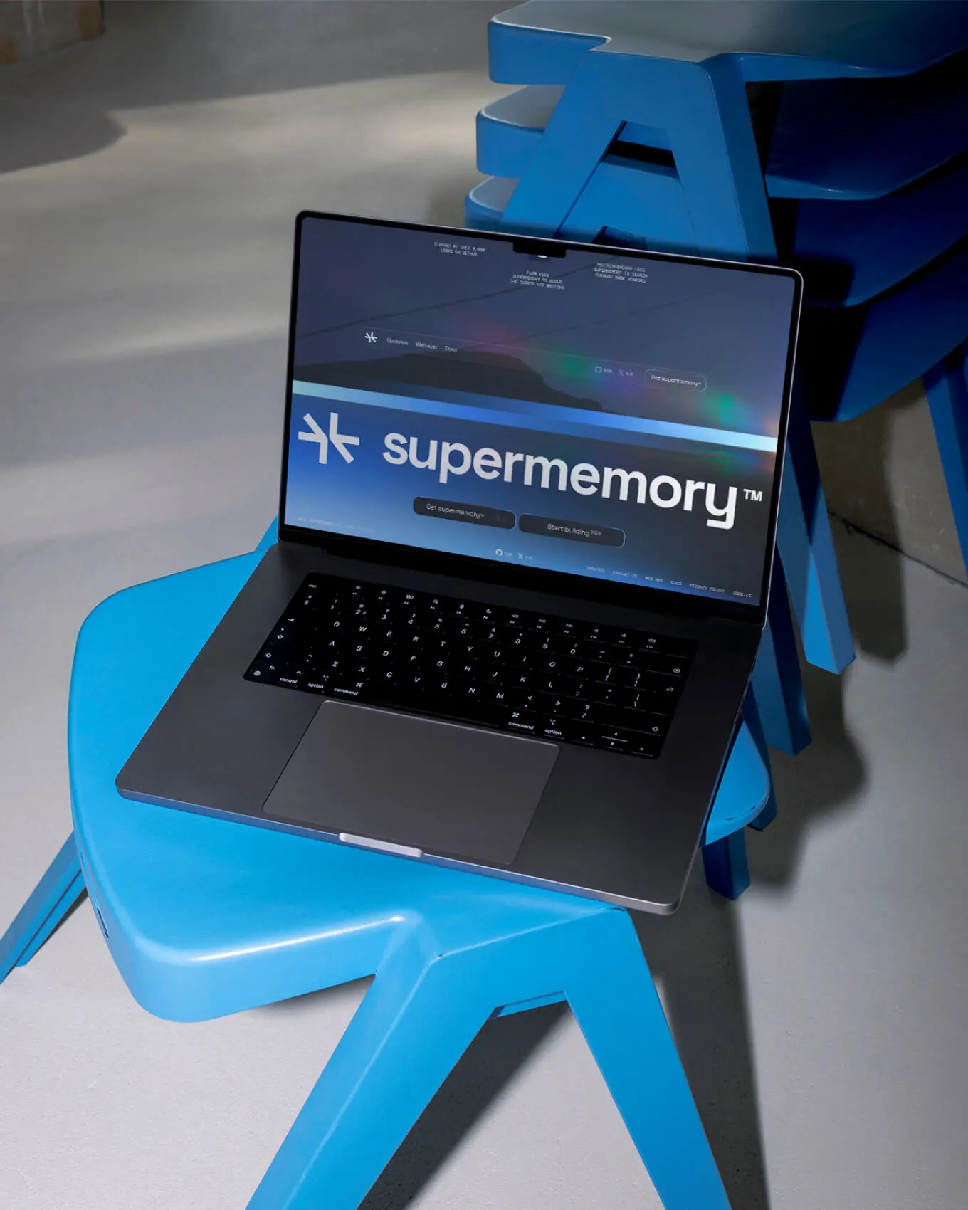
When designing the brand we leaned into the idea of chaos becoming clarity. The visual identity uses metallic blue gradients and sparkling interactions to show data converging into meaning: an invisible force tidying the digital universe. Motion on the website keeps it alive, and the logo - two arrows almost meeting in a star - captures that moment when everything suddenly clicks.
The new brand makes Supermemory feel sharp but still approachable: something open-source devs can dive right into, and enterprises can trust to scale. The website works the same way the product does: clean, smart, and quietly doing the heavy lifting in the background. The result isn’t flashy for the sake of it. It’s confident, warm, and just human enough to make users trust what’s underneath.
Branding
Web Design
No-code
Figma
Webflow
Client’s words


